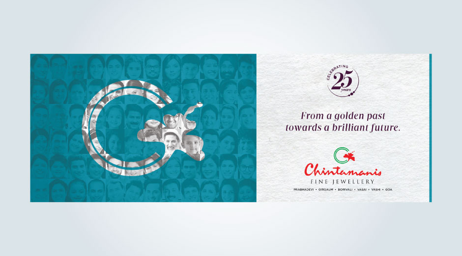
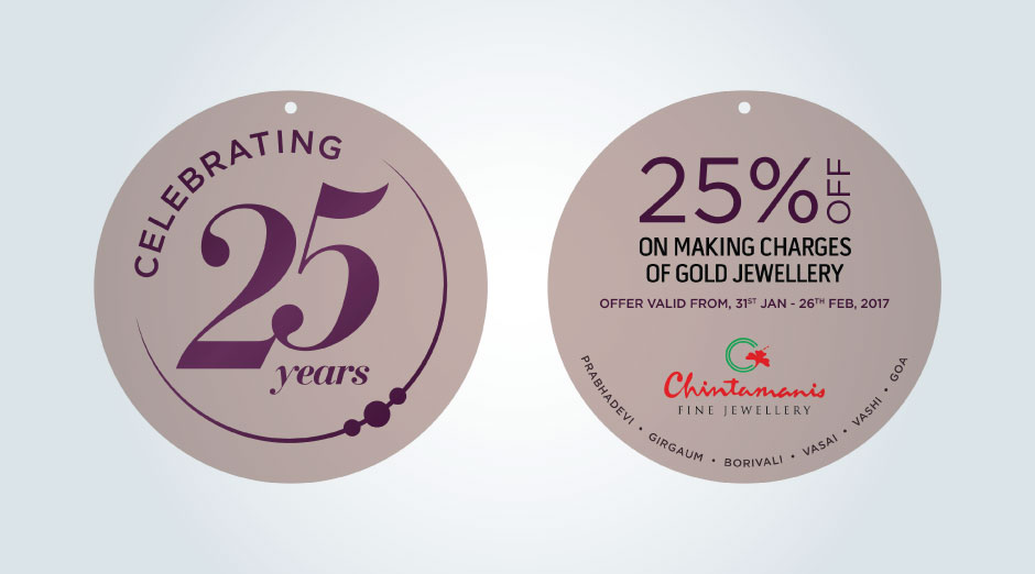
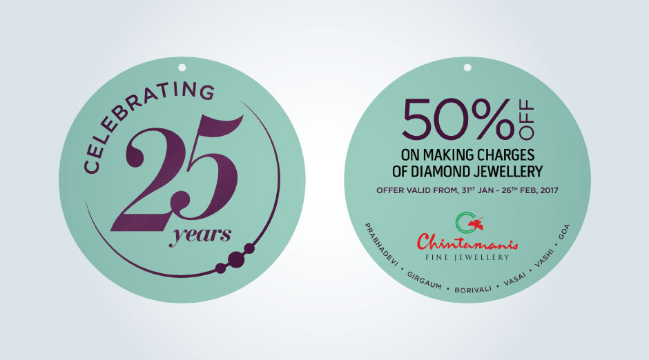
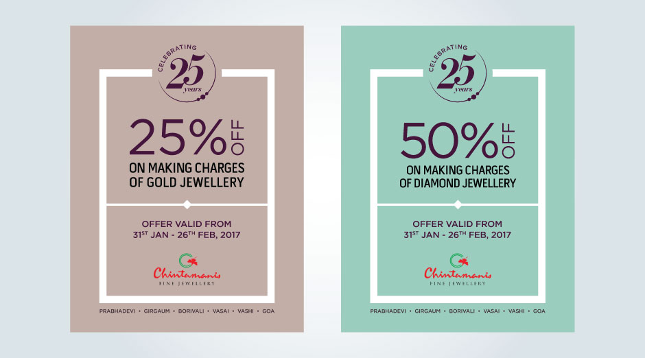
A pedigree brand with a legacy of more than 21 years, cutting-edge designs, loyal customer base, iconic location for flagship store, multiple outlets across the city – seemed like everything that any jewellery brand could ask for.
For Chintamanis it was all this and more – including the immense goodwill created by the founding family which translated into brand recognition, trust and the steadily growing customer-base. However, the challenge for the brand was the perception amongst audiences that Chintamanis was predominantly a ‘Maharashtrian’ brand. They were not able to attract much footfalls from the other communities.
The founders being a well-known and respected Maharashtrian family, this perception was but natural. In the jewellery business, unless the brand catered to the other communities as well – Gujaratis, Marwaris, North Indians, South Indians – it got slotted as a ‘traditional family jeweller’, and found it impossible to scale up.
This, in a nutshell, was the challenge faced by Chintamanis which formed the basis for the internal brief created by YOUNG for the brand in 2012 – to move away from the traditional form of communication which Chintamanis was hitherto following. We had to create a brand appeal which would draw other communities into the Chintamanis showrooms, and help the brand break away from the perception of being a Maharashtrian brand.
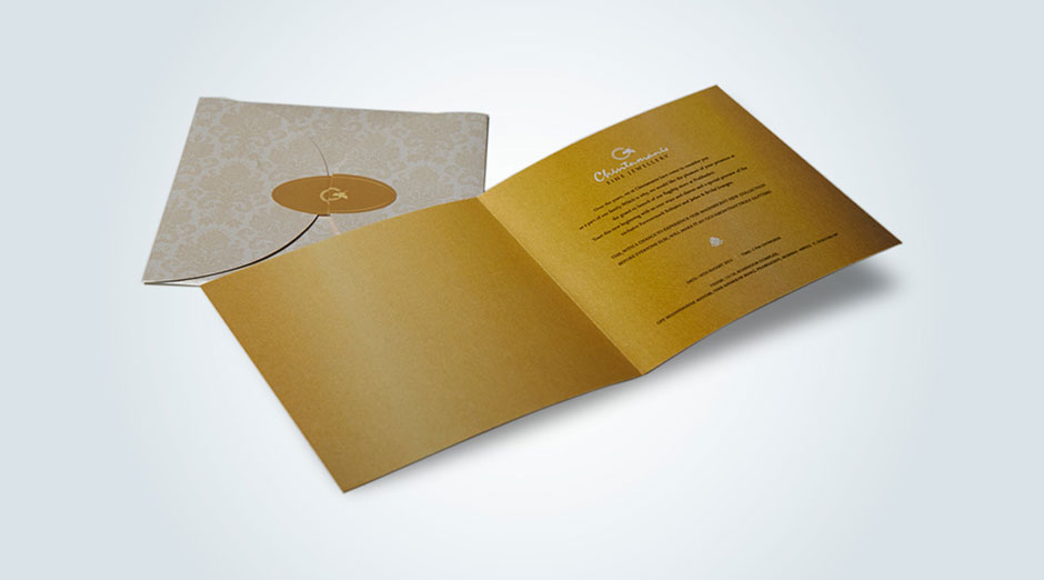
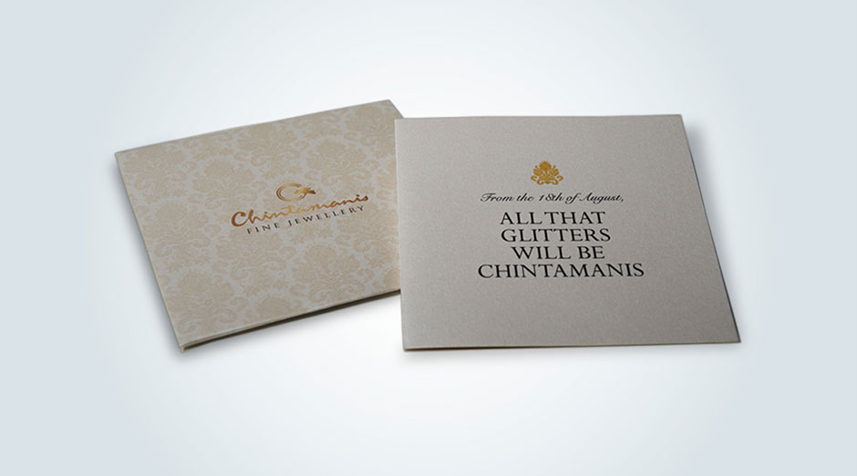
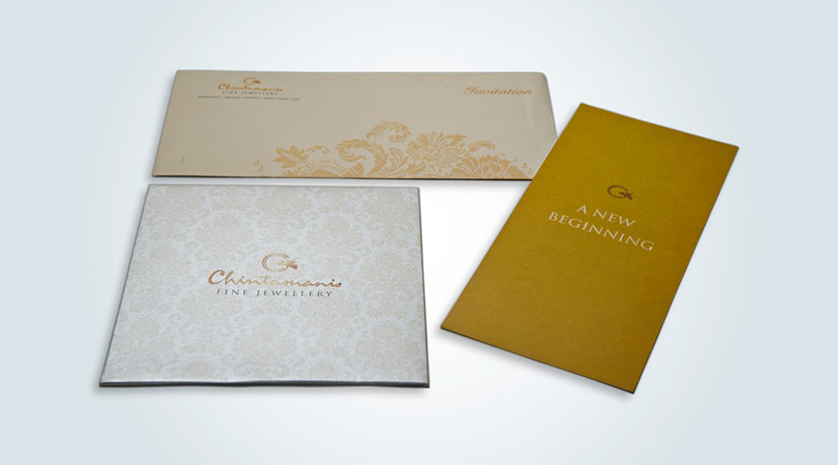
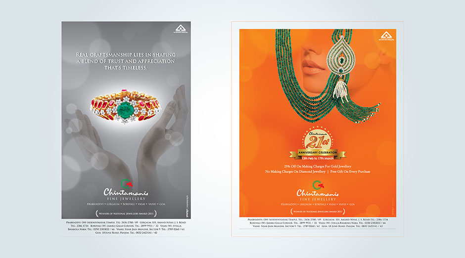
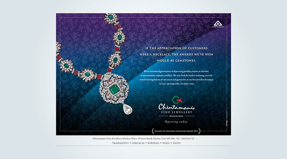
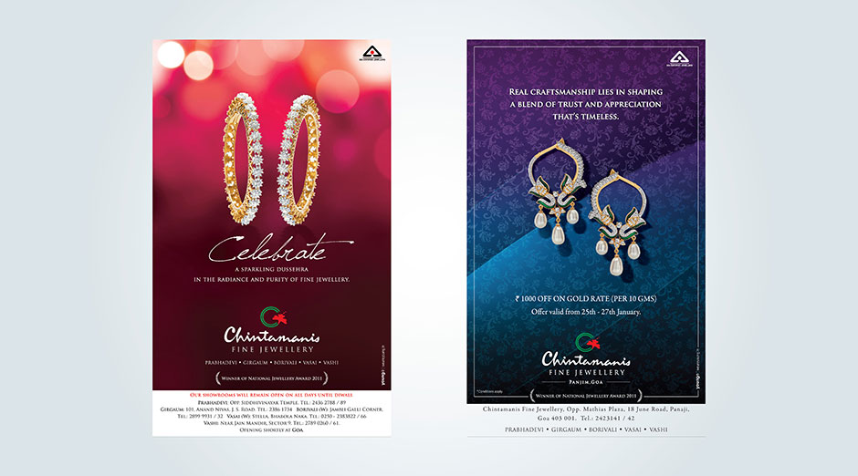
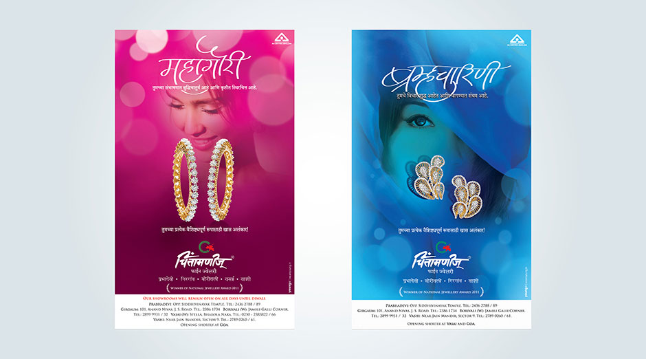
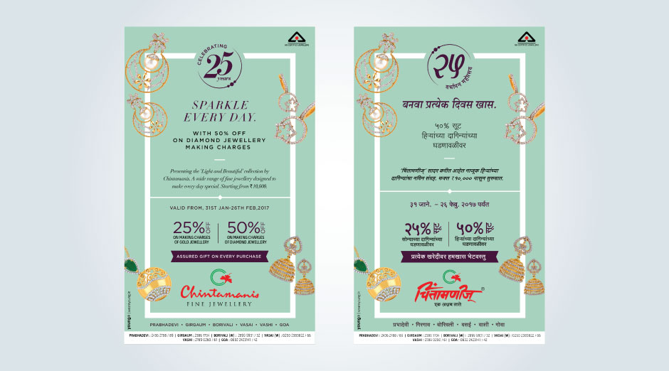
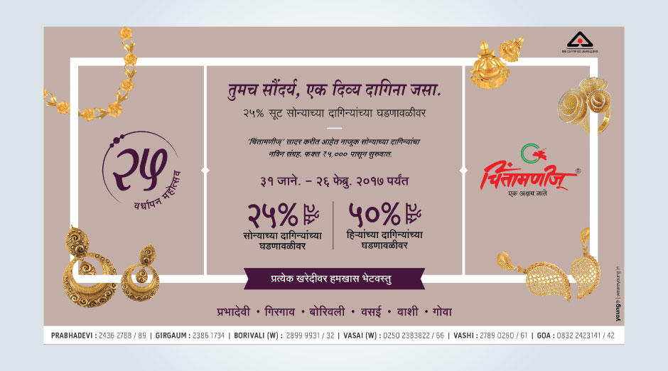
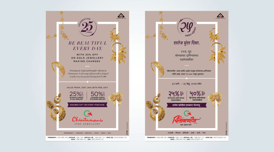
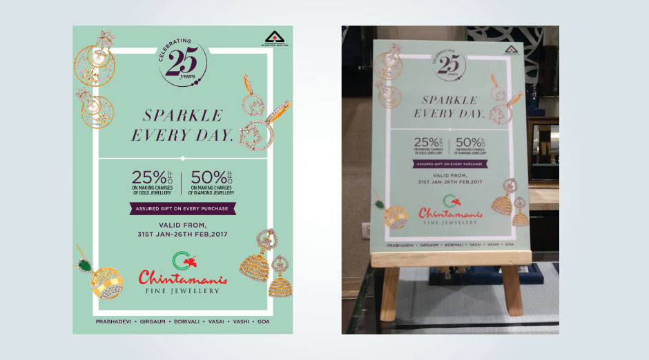
YOUNG worked on a completely differentiated look and feel. As against using models for showcasing the designs, the approach which was taken was to showcase the jewellery piece and the design itself as the central aspect of the communication.
In every creative, the jewellery piece was treated as the hero of the communication. Also, the design template which was created was a very clean and aesthetically appealing layout, with subtle background which provided the perfect backdrop for the task at hand – i.e highlighting and amplifying the jewellery pieces.
Even in campaigns for traditional promotions such as Mangalsutra Festival, Navratri Festival etc., the above guideline was maintained and the balance between tradition and aesthetics was achieved in perfect sync. The Navratri Festival campaign which was created using a ‘colors of Navratri’ theme, is a proof of this perfect balance of tradition v/s aesthetics which was achieved by YOUNG. This campaign won a lot of recognition and accolades in various jewellery advertising forums.
As a communication strategy, YOUNG also designed a “Diamond Delights Festival” campaign for Chintamanis, which kick-started the festive season 2012 for the brand. Diamonds being the appeal-factor, mostly for the Gujarati, Marwari and North Indian communities, this was a strategic approach in sync with the objective of breaking away from the ‘traditional Maharashtrian brand’ slot for Chintamanis.
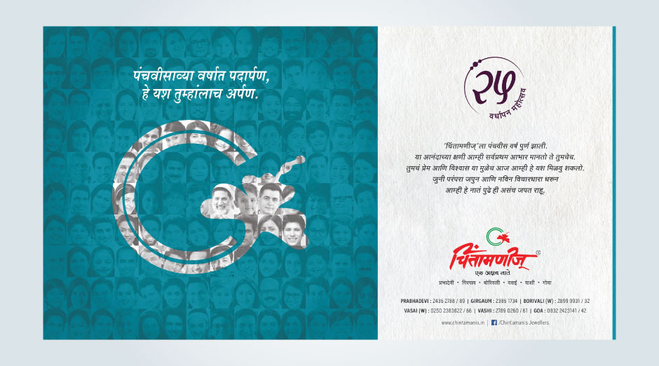
The campaigns created by YOUNG for Chintamanis from 2012 to 2014, have created the desired differentiation factor for the brand and helped them move away from the perception challenge which they faced.
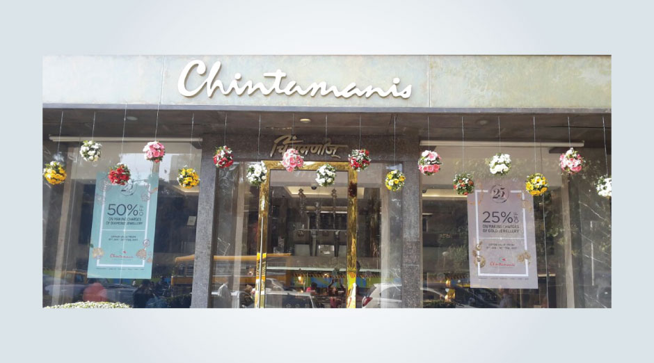
On the back of the successful brand transition, Chintamanis, in the 2nd half of 2014, also undertook a complete image-makeover of its flagship store at Prabhadevi, which now glitters with a contemporary look and dominates the iconic location opposite the Siddhivinayak Temple.
Brand Identity, Brand Strategy, Advertisement Campaign, Media Plan, Marketing Collaterals.


